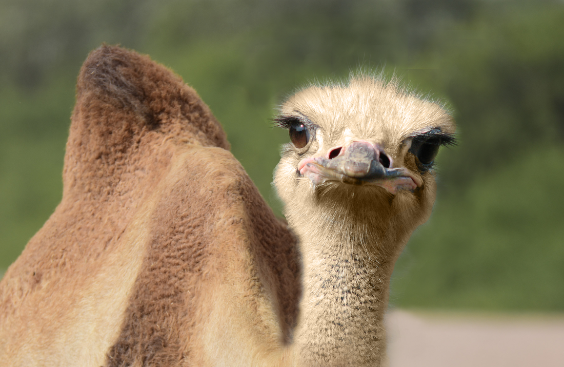
 One of the problems that I faced while making this piece was using the clone stamp tool. I was having difficulty with the target moving places as I moved the brush. To overcome this problem I asked Mrs. Sudkamp for help and she helped my understand the process better. If I could change anything about my piece I would add a more interesting background and have my animal doing something more interesting than just looking at the camera. My animal is a mix between an ostrich and a camel. The official name its species is a camel who can't fly. This is because an ostrich cannot fly and since it is a camel as well it is therefore a camel who cannot fly. I came up with this idea on a Wednesday when I thought "Omg, it's hump-day! Omg a Camel!" Then I just really liked this picture of an ostrich so I combined them.
0 Comments
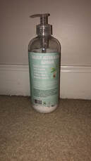
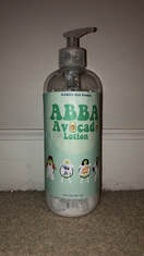
ABBA Avocado Lotion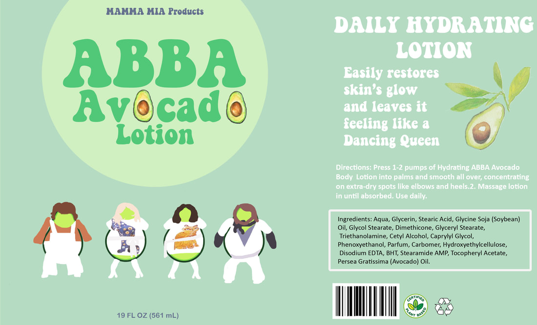
I picked lotion because I had just run out and had a clean bottle at my house. I also was recently listening to the Mamma Mia soundtrack right before Mrs. Sudkamp assigned this project. I designed my product by creating a Photoshop file with the same dimensions as my bottle. I designed each individual avocado cartoon to match a picture of the group ABBA (seen above.) Then I added a logo and company in a groovy font to help shape the theme. I added other details such as the ingredients, bar-code, recycle symbol, and the size of the bottle to make it more realistic. I finally printed my design onto sticker-paper and put it on my bottle to create my finished piece. I think the most successful part of my design were the avocados that look like members of ABBA. I am very proud of myself that I was able to make them detailed and realistic even though they were not humans. If I could change anything about my piece, I would change the side of the bottle that has the ingredients. I would add more details to help emphasize the groovy theme of the product instead of just being there to take up space. Commercial/ Advertisement
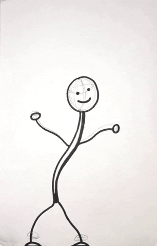
I made this piece by drawing a figure on a sticky note and slightly changing the position of it so that it appears as though it is moving when I flip the pages. I used the first principle of animation, squash and stretch, throughout by piece. Squash and stretch gives the illusion of weight and volume to an object as it moves. I used this principle in the beginning with the bouncing ball and in the middle with the falling boulder that squishes the little stick figure. Something that I think went well was the bouncing ball and the "the end" at the end. If I were to change something about this piece, I would make the objects more detailed and add more of a story line rather than just little scenes together.
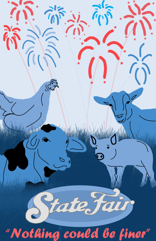 Something that I really like about my piece are the silhouettes of the different animals because, I was able to make each one look realistic while not being over-detailed. I also really like my color scheme and love the pops of red in the quote and fireworks. If I were to do this project again I would add more elements from the state fair, such as a ferris wheel or other rides, to make it look prettier and more festive. One thing that was difficult while making this piece was keeping the lines clean and not sloppy. Although I used the quick selection tool to help make the silhouettes of the animals, I had to paint over the edges due to the lines not being clean enough.
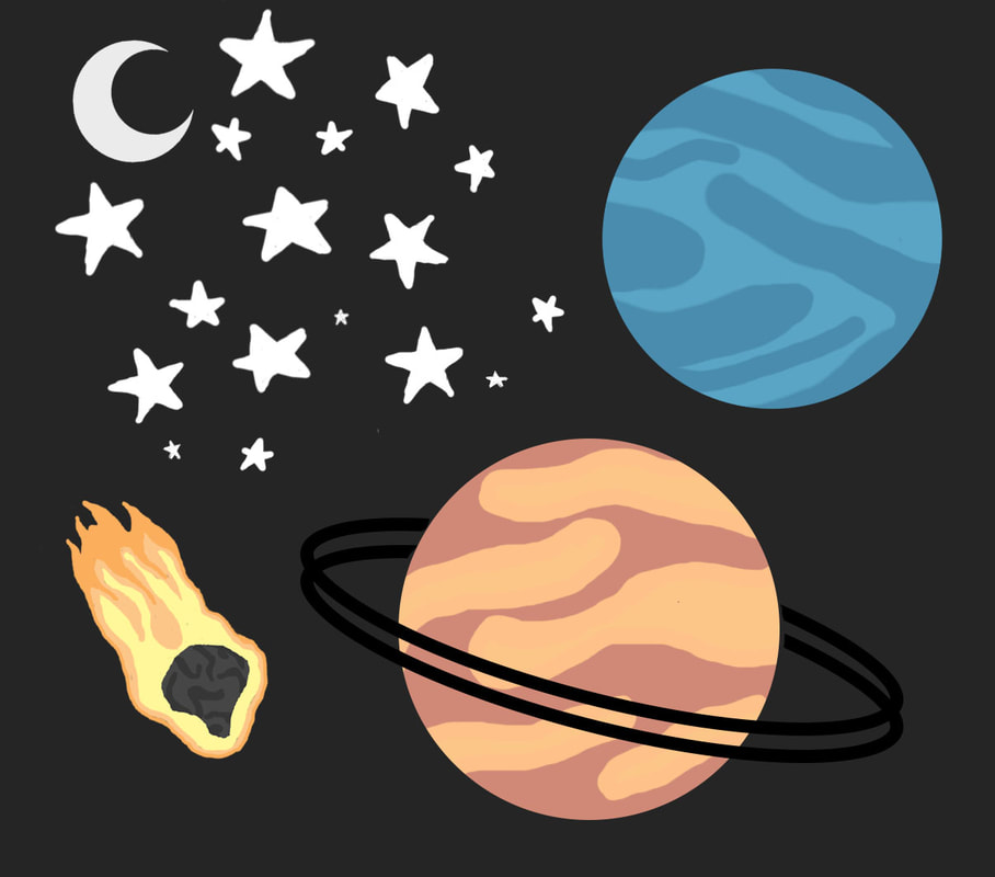
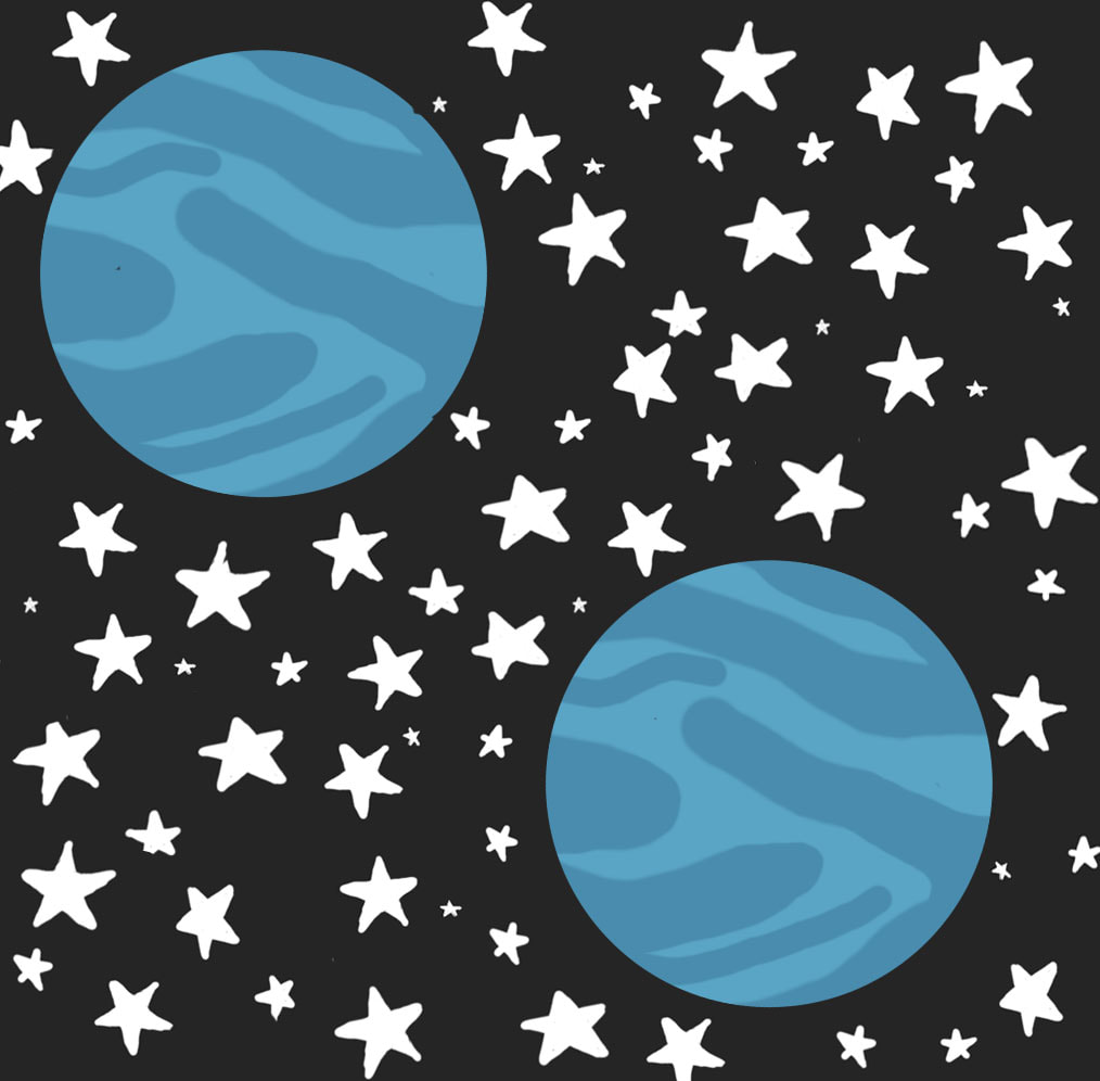
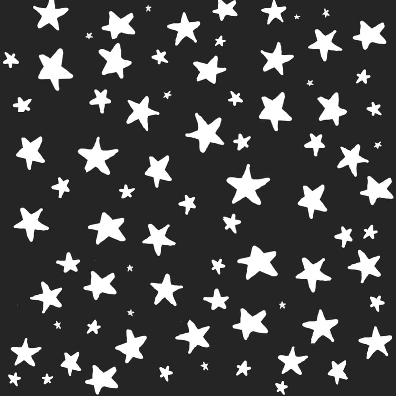
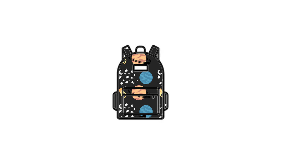
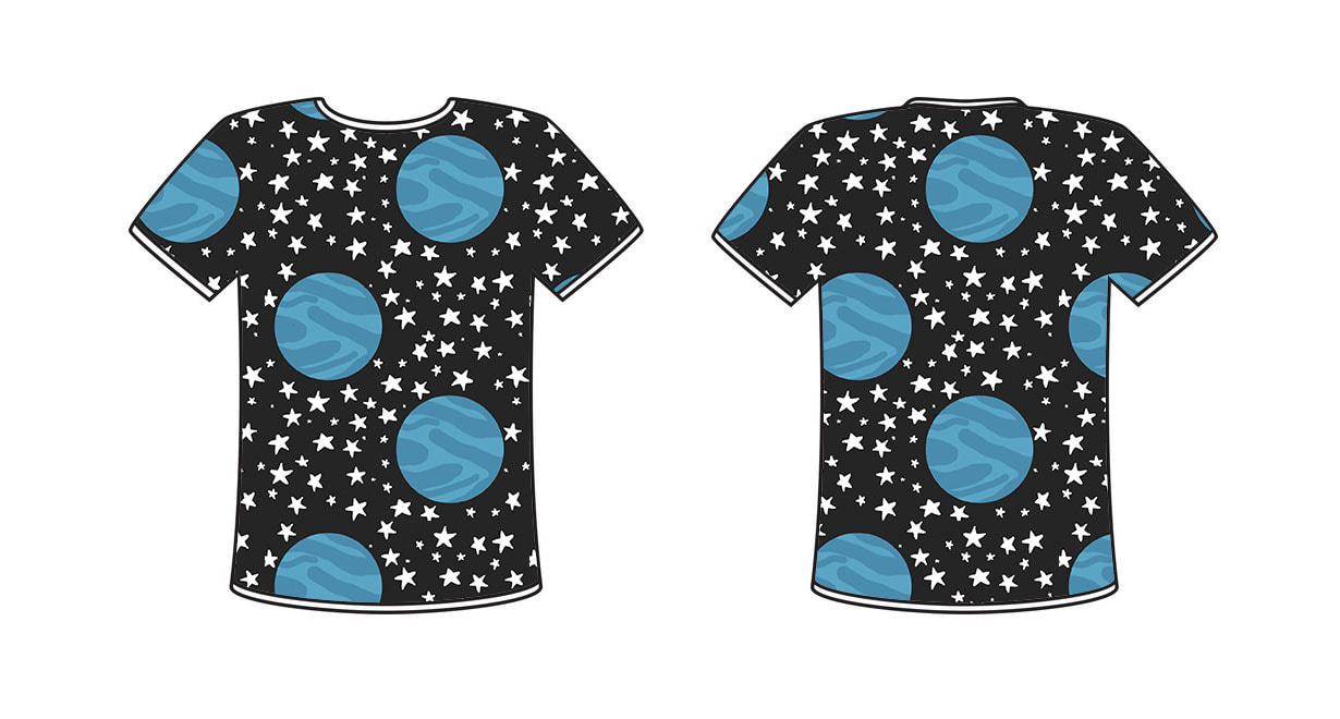
My theme was outer space, especially stars and planets. I picked it because I love stars and I was able to think of sketches for space relatively quickly. My favorite pattern that I made is probably the third pattern with only stars because it took me the longest and is the most visually appealing to me. I found it difficult to make crisp and clean lines while drawing in Photoshop, you have to have a steady hand and be able to edit in order for drawings to look nice and clean. To someone starting this project, I would recommend that they use basic sketches and designs because it is very difficult to create detailed drawings in Photoshop.
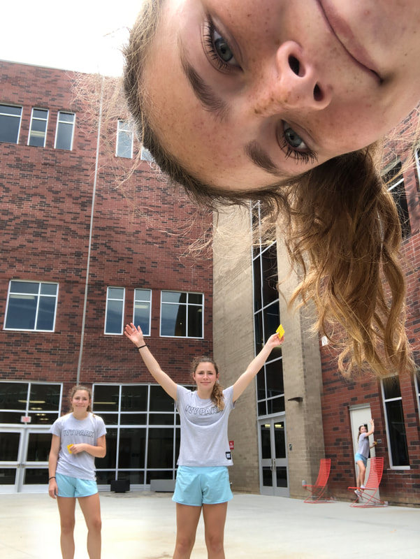 During this project one problem that I faced was uploading my pictures to the computer. In my first attempt, the pictures were the wrong size and became blurry when uploaded to Photoshop. In my second attempt, I chose the wrong pictures to send so they ended up overlapping and having differences in lighting. In my third and final attempt, I finally uploaded the correct pictures in the correct size. If I could change anything about this, I would choose different positions to make it more interesting and cohesive.
|